Project [01] Plotly
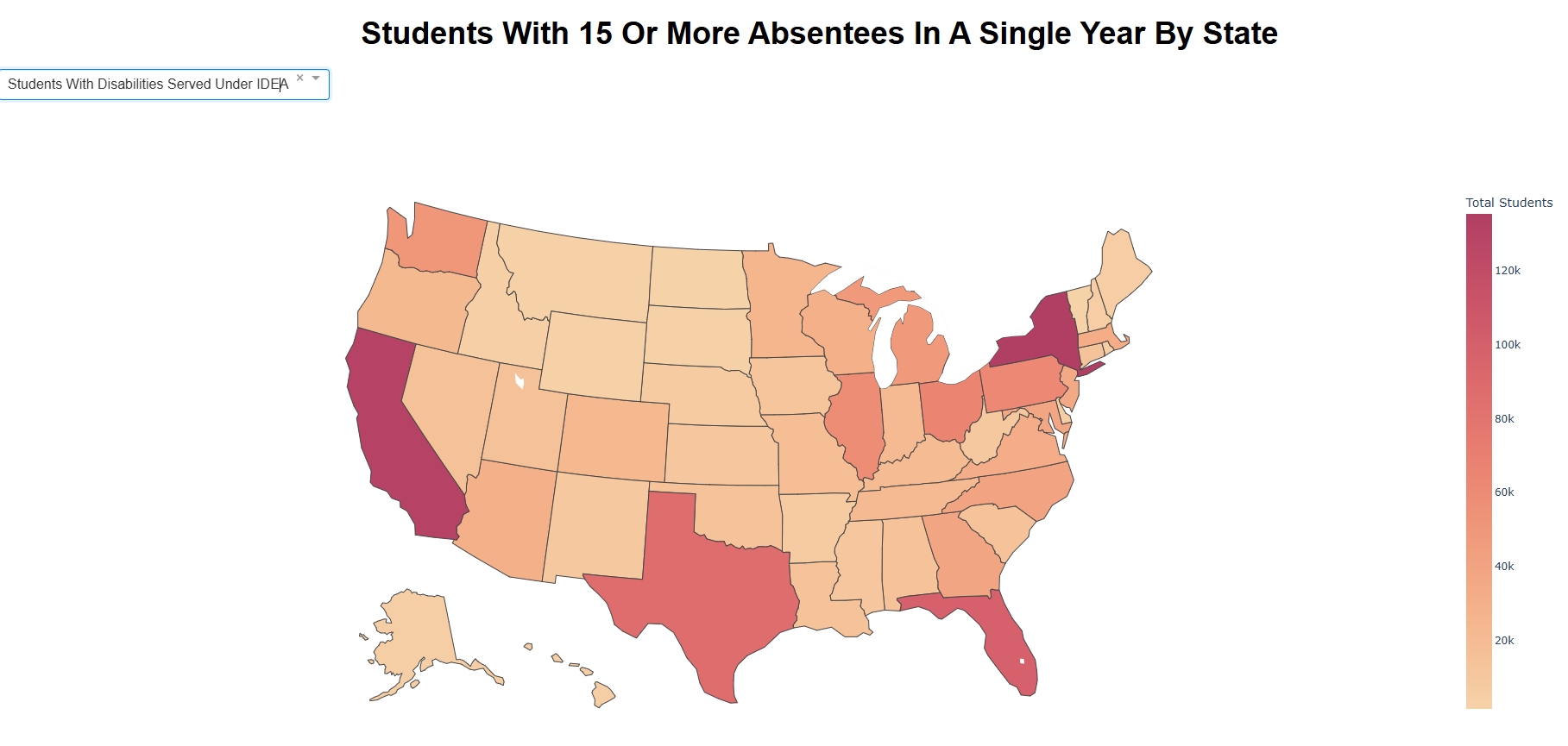
Data Visualization Dashboard: US Student Absenteeism
Interactive map-based dashboard visualizing student absenteeism rates across the United States by disability status and race.
Plotly CSS Render
[project_index]
A focused index of systems, analytics work, and experiments that reflect how I approach real-world data and software problems.
Interactive map-based dashboard visualizing student absenteeism rates across the United States by disability status and race.
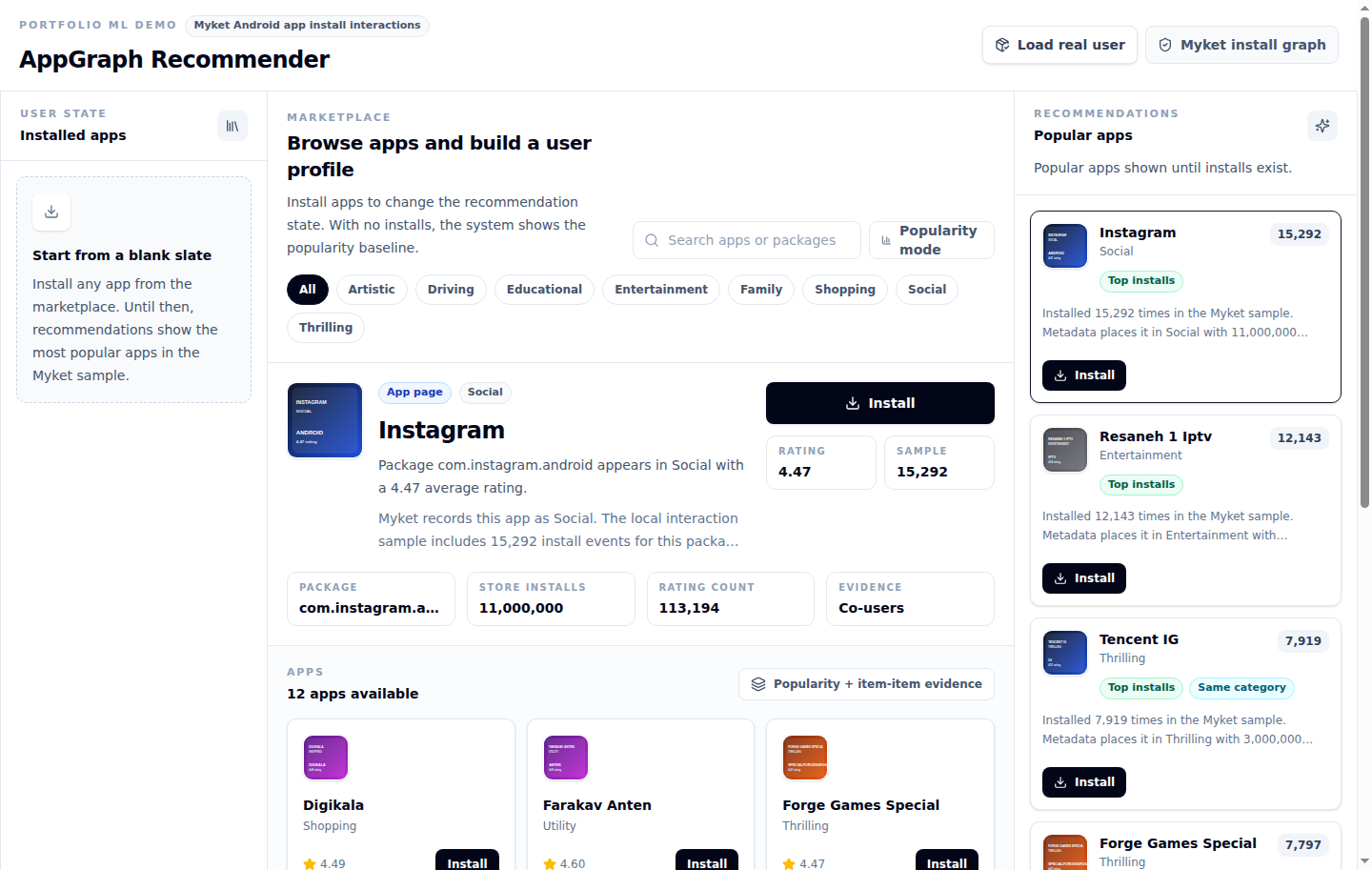
Interactive recommendation demo comparing popularity and item-item models against a real Android app install history.
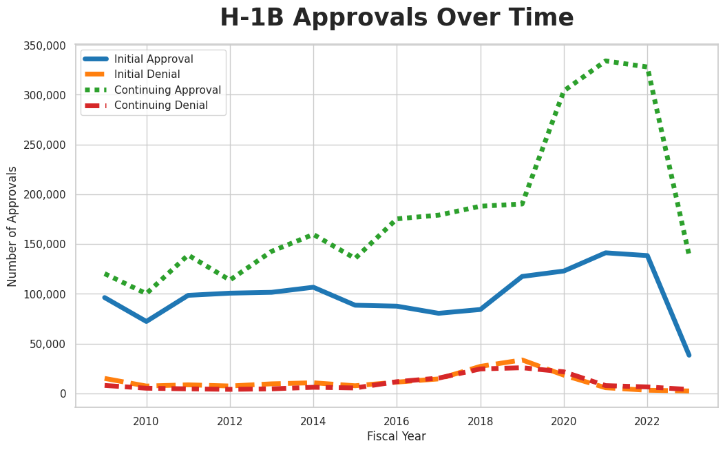
Seaborn-based time-series analysis of H-1B visa approvals in the United States, showing how approval volume changed over time.
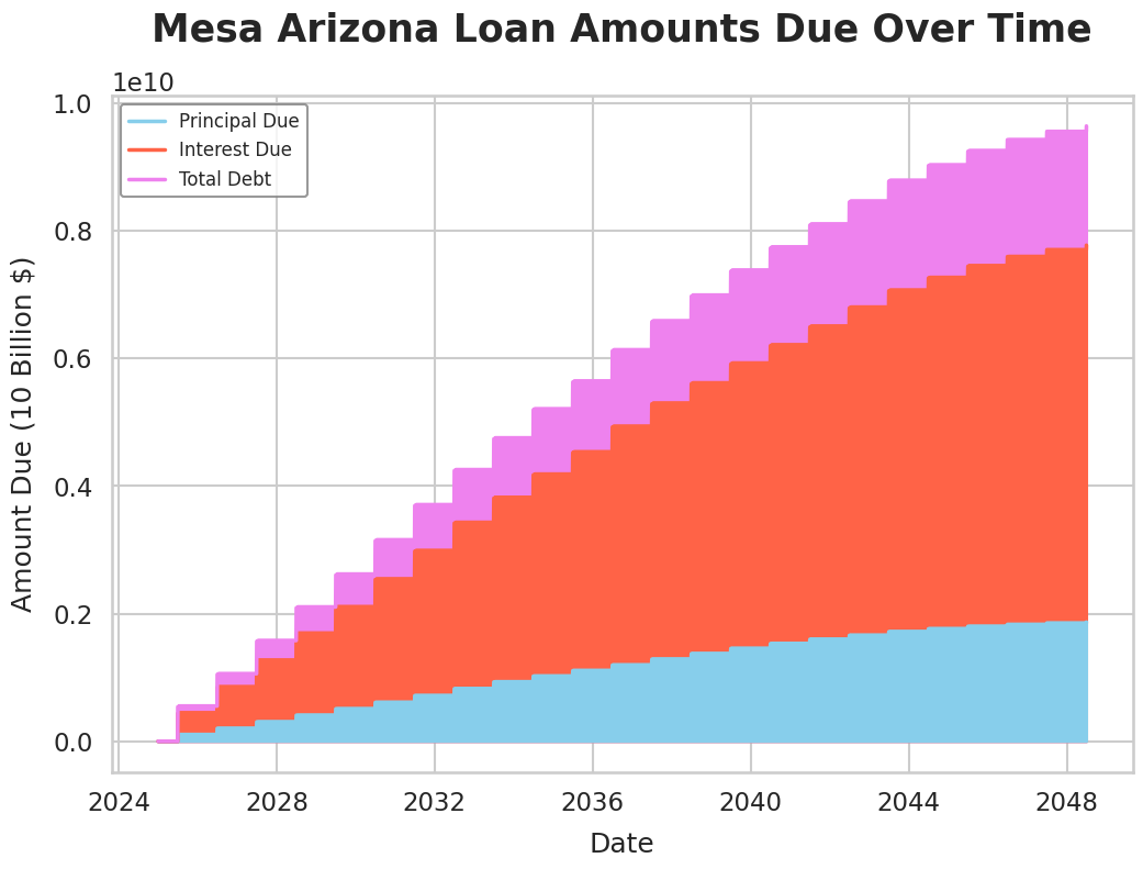
Seaborn visualization exploring outstanding loan balances for the city of Mesa, Arizona to surface trend and distribution patterns in municipal debt data.
Machine learning project that predicts MMA fight outcomes from historical data.
Monte Carlo simulation for optimizing fantasy basketball draft selection through the Colonel Blotto game framework.
RESTful API serving a neural network that estimates vehicle fuel efficiency from engine and model data.
Machine learning project using generalized linear regression and word embeddings to predict shoe prices with big-data tooling.
Portfolio site demonstrating frontend implementation skills across HTML, CSS, and JavaScript.
Shot-quality analysis of NBA teams using custom metrics and visual exploration.